Montañez Elementary "Home of the Otters"
Overview
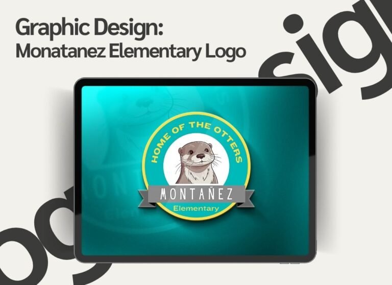
The Montañez Elementary logo, themed “Home of the Otters,” is a vibrant and engaging design, primarily aimed at representing the school’s mascot and fostering a sense of identity within the school community. The logo is playful yet professional, appealing to both students and parents.
Design Elements
Color Palette:
The design predominantly features shades of teal and green, which are both calm and inviting, symbolizing tranquility and growth, qualities important in an elementary school setting. The yellow border adds contrast and energy to the design, making the logo more noticeable and vibrant.
Typography:
The text “Montañez Elementary” is placed prominently on a ribbon-like banner across the bottom of the circular design. The font used is modern and easy to read, with all uppercase letters for “Montañez” creating emphasis and importance. “Elementary” is in a smaller, lighter font underneath, balancing the design.
The phrase “Home of the Otters” is curved along the top, using a simple sans-serif font in yellow that contrasts well against the green circle. This highlights the school’s mascot and its significance.

Mascot Illustration:
The otter, depicted in the center, is the focal point of the logo. It’s drawn in a cartoon style, making it friendly and approachable for the elementary school audience. The otter has a gentle and welcoming expression, which promotes a sense of community and warmth.
The background behind the otter is kept white to provide a clear, contrasting area that allows the mascot to stand out prominently.
Shape and Layout:
The circular design is symbolic of unity and inclusivity, a shape often used in educational logos to represent community and togetherness. The inner circle with the mascot and the outer ring containing the text creates a structured and organized feel, which is important for branding in an academic setting.
The ribbon element adds dimension to the logo, giving it a more dynamic look while ensuring the school’s name remains a central focus.
Symbolism:
The otter, a playful and intelligent animal, is a fitting mascot for an elementary school, representing curiosity, learning, and social interaction. This ties in well with the school’s values of education and fostering a supportive environment.
Design Impact
Audience Appeal:
The logo is designed to be fun and friendly, making it appealing to young students while still maintaining professionalism for parents and staff. The use of a mascot adds an element of fun, making the school’s identity memorable and engaging.
Brand Identity:
The clear representation of the otter and the school’s name in the logo ensures strong brand recognition. It helps Montañez Elementary differentiate itself from other schools while also building a sense of pride and community among students and faculty.
Versatility:
The logo is simple and clean, making it versatile for use across various platforms, such as school uniforms, stationery, signage, and online materials. Its vibrant colors and friendly design ensure that it remains effective whether printed in large formats or used digitally.
Conclusion
The Montañez Elementary “Home of the Otters” logo effectively captures the school’s spirit with its bright color palette, approachable mascot, and balanced typography. It creates a strong sense of identity for the school, appealing to both children and adults, while promoting values of community, learning, and fun.